ARTWORK GUIDELINES
What are bleeds, and why do I need them?
When items such as business cards & postcards are printed, they are not printed on paper of the final size, but are instead printed as a group on a large sheet. Items cannot always be cut perfectly on the trimming line, so an extra amount of ink is printed on the outside of the area to be cut.
This is called the bleed, as it is a part of the artwork that “bleeds” off of the printed area. It prevents imperfections, such as unwanted white borders, from appearing and ensures that colors and patterns extend perfectly to the edge of the final product.
Bleeds are required for all print-ready files, and are outlined in all of our supplied templates.
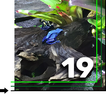
Bleed: Extend the colors or images to the edge of the black line, past the dark green cut line.
Trim and Safe Zones
Our templates also provide guidance for trim and safe zones. The dark green line indicates where the final product is trimmed, while the second bright green line indicates the safe zone.
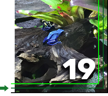
Trim: The image is to be cut here on the dark green line. Note the bleed on the outside.
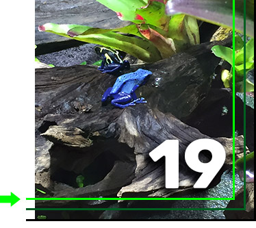
Safe Zone: All important elements in the design, such as text, should be placed inside of the safe zone, within the bright green line.
The safe zone is inside of the area to be cropped, at the same distance inside the cut line as the bleed is from the outside. Much like the bleed, it ensures consistency in the final product and keeps important elements from disappearing from the design.
Can I use borders in my design?
Placing borders on the artwork isn’t recommended as the design can shift, causing them to look uneven. This is especially the case for small products such as postcards & business cards.
Colors and Color Modes
What is CMYK, and how do I make a CMYK file?
CMYK is the color mode primarily used for printing. The four letters represent the four ink colors used: cyan, magenta, yellow, and key (black). It is highly recommended to use the CMYK color mode for all printed files.
RGB images may look brighter or cleaner on a screen, but they will often not turn out that way when printed, since the RGB color space is meant for light, not ink.
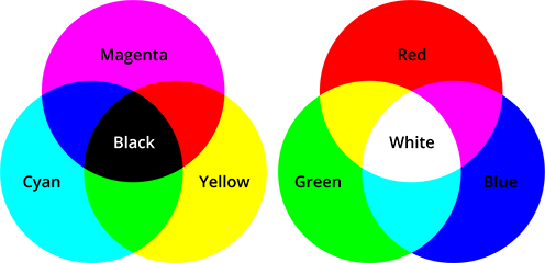
CMYK (left) and RGB (right) color modes.
Although it’s a good idea to use CMYK from the start when working up a design, converting RGB files to CMYK is quick & easy. In Photoshop, select Image, Mode, then CMYK. However, it’s not recommended to convert CMYK images to RGB, since the additional color information can be lost forever.
What color options are available?
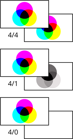
There are 3 categories for pre-press printing:
- Full Color Front / Full Color Back (4/4): Four color job on both the front & back sides of the product.
- Full Color Front / Grayscale Back (4/1): Four color job on the front & black ink (grayscale) on the back.
- Full Color Front / Blank Back (4/0): Four color job on the front with no printing on the back.
What file formats are accepted?
We accept the following formats for uploaded designs: TIF, TIFF, EPS, AI, PSD, BMP, GIF, JPG, JPEG, PNG, and PDF.
Please ensure that raster images are at least 350 dpi, and that all layers are flattened for psd’s. For vector file formats, please embed all images & outline all fonts.
What is the difference between raster and vector?
Raster images are made up entirely of pixels that make up the final image, similar to mosaic tile art. Because of this, scaling up raster images results in the final product appearing either blurry or pixelated, so any raster image intended for print should be stored in a high resolution. Raster image formats include TIF, TIFF, PSD, BMP, GIF, JPG, JPEG, and PNG.
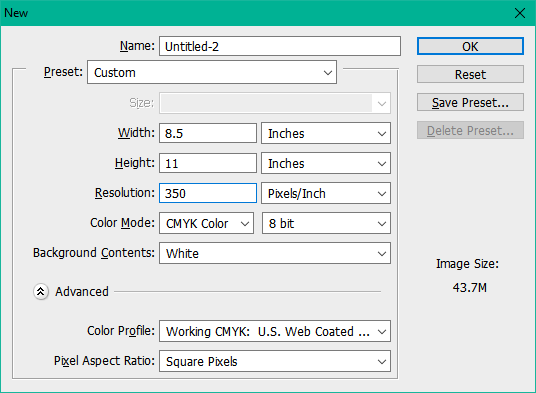
Creating a 350 DPI image in Adobe Photoshop.
Vector images are stored as mathematical calculations for each shape, so they can be scaled up or down at will without loss of any information or clarity. Vector image formats include AI, EPS, and PDF.

Sometimes, vector image formats can include raster images within them. If they are necessary parts of the design, they should be embedded prior to sending the file for printing. That can be accomplished in Illustrator by selecting the raster element, and then clicking the “embed” button that appears in the top-left corner of the window.
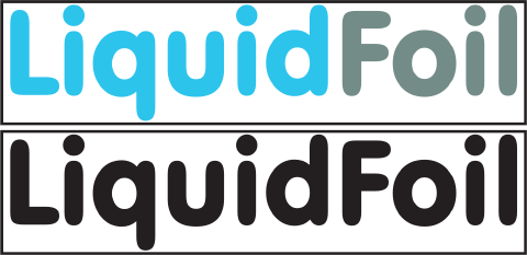
Spot colors can be added to designate UV & Foil coverage, which can be used to make specific elements in the design really pop! We have high gloss spot UV, raised UV, and Liquidfoil available.
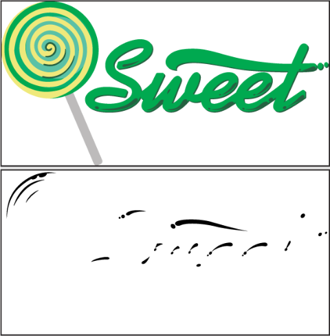
For example, the logo below can have glossy elements added to bring a bubbly or shiny appearance to the artwork.


How to create a high gloss spot UV layer in Illustrator:
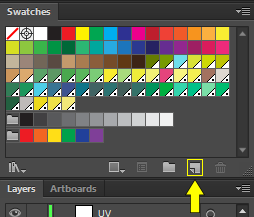
First, make sure that the swatches window is visible or docked to the side panel (Select Window from the menu bar, then Swatches).
Next, create & select all the shapes you wish to turn into gloss. If you wish to coat an entire existing shape with gloss, select the shape and paste it in place, and in a top layer (shift+ctrl/cmd+v).
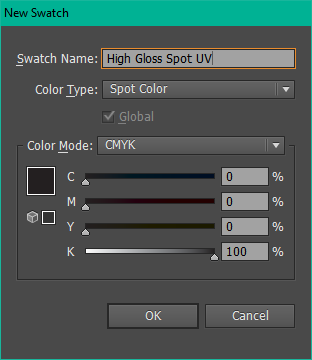
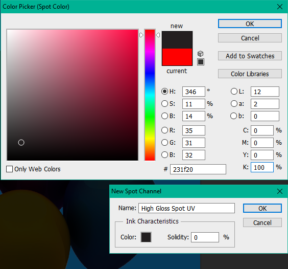
After, color the shapes with a 100% black (C=0, M=0, Y=0, K=100), and create a new swatch from the Swatches panel.
Then in the New Swatch window, select Spot Color from the Color Type options, and name the swatch “High Gloss Spot UV.” Now anything colored with this swatch will become UV coating instead of printed as an ink color.
The same concept applies to raised UV & LiquidFoil. To denote Raised UV, use a swatch named “Raised UV”, and “Foil” for Liquidfoil. The masks can also be exported as different files, separate from the design, as shown below.
In this sample, the top segment is the starting graphic, with the mask below designating spot UV.
The top segment is to be the resulting colors of the foil, with the mask below being the foil underneath.
Transparencies can also be used to adjust the level of coverage on foil, or different thicknesses for raised UV.
How to create a high gloss spot UV layer in Photoshop:
Open up the CMYK art file and use the wand tool to select all areas that need spot UV with the wand tool.

Next, from the Channels window (select “Window” then “Channels”), create a new Spot Channel. This menu item will appear by selecting the small hamburger menu in the top right of the Channels window.
Name the new channel “High Gloss Spot UV” and change its color to all black (C=0, M=0, Y=0, K=100). The new channel will show beneath the existing color channels.
Now, the UV channel can be previewed by deselecting CMYK. Switch off the High Gloss Spot UV channel by selecting CMYK, and deselecting the UV channel.
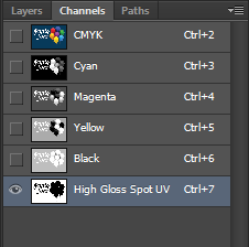
Finished channels.
Finally, the PSD document should be saved as a PDF and opened in Adobe Acrobat. From there, check the Output Preview, select the High Gloss Spot UV Channel, and make sure that “Simulate Overprinting” is checked.
When sending art for screen printing or embroidery, all received files must be in a vector format (.pdf, .ai, .eps), and all colors in the design should be spot colors. We recommend using the PANTONE+ Solid Coated swatch library, which can be selected from the Swatch Libraries menu, from the Swatches panel.
To check if all colors in the art are spot colors, open up the print menu within Adobe Illustrator, and select Output from the left-hand side. Under the Document Ink Options, if a printer icon does not show by the Process colors, then the art has successfully been converted into all spot color.
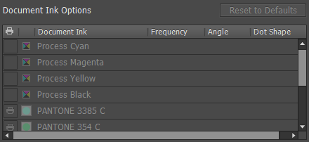
A successfully converted document in Adobe Illustrator’s print menu.
 Sign In